some tips and tricks that have seriously helped me in excelling at watercolour
1.PAPER WEIGHT. for the love of god do not use any paper under 110-120 lbs to paint with watercolour, a very VERY wet medium that will soak clean through the paper if it’s not thick enough (most paper pads sold at craft stores have the weight listed on them. printer paper is around 20 lbs, sketch pads will be about 60 lbs, IDEAL watercolour paper 140 lbs+). i use only 140 lb paper for my serious watercolour works. canson and strathmore are my favourite brands
2. there’s no need to have very expensive watercolour paints, but it is important to use something better than crayola. my dad gave me a 24-pan windsor&newton watercolour set when i was 8 and these are still the paints i use today (i was a very careful child, but i never even had to replace my paint pans after almost 10 years either, so this brand, while super expensive, lasts and earns my gold star.) some other cheaper options are: x and x
3. if you’re going to be using watercolours, prepare to use WATER. so many people forget this, but it’s so important to realise this media is meant to look translucent, so you should see the paper through the paint. if you can’t see it, then you’re using the paints as if they’re gouache or acrylics, so try using more water and work with lighter colours.
OKAY NOW FOR THE ACTUAL TRICKS
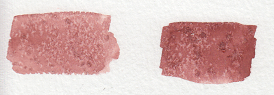
4. SALT
quite overused in watercolour but it’s so freaking cool it can be pardoned. *remember for all of these effects, you have to use lots of water with the paint for it to work!
5. ALCOHOL/VODKA/HAND SANITIZER IF YOU’RE LAZY LIKE ME
you have to be very careful here because the second image can turn into the first if you use too much alcohol and it soaks through the water and paint gets in the spot, so be sure to experiment plenty before using this!!
but yeah you can use whatever clear alcohol you can find and it does p much the same thing
6. LIGHT SKIN TONES
okay while the darker skin tones are more easily achievable with browns and additional yellows/blues/reds to bring out the undertone, light skintones are hard as hell to make with watercolour because it’s hard to even think of what to mix. think no more!
YELLOW OCHRE + ANY PURPLE = perfect skintone you can play around with. adding more of yellow or purple will give you either cool or warm skin tones you can build up on and layer until they’re the proper value. remember to use purple/cool shadows with skin in compositions with normal lighting!
7. PAYNE’S GREY
and finally to repeat my previous post, use PAYNE’S GREY instead of black for a richer, darker colour in your painting. don’t use black unless your entire composition has warm colours, but even then, try to use a very dark brown instead of black.
8. WHITE
finally, it’s very important to mention this: never use the white watercolour they sometimes give you. EVER. EVER. dilute your paint with water instead to get a lighter value, or else you’re not using watercolour to its full extent (which is something you might struggle with if you’re used to using acrylics or oil)
—
that’s all i can think of at the top of my head, but if you have any questions or need further brand recommendations etc, feel free to message me!
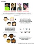
A compilation of stuff I know about drawing Asian faces and Asian culture! I feel like many “How-To-Draw” tutorials often default to European faces and are not really helpful when drawing people of other races. So I thought I’d put this together in case anyone is interested! Feel free to share this guide and shoot me questions if you have any! I’m by no means an expert, I just know a few things from drawing experience and from my own cultural background.
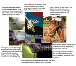
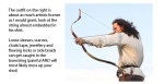
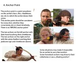
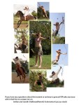
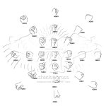
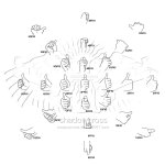
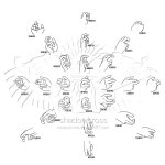
Spent the last two days working on this little archery guide in art and writing. Considering the rise in popularity of archers in pop culture this hopefully comes in handy for a bunch of fandoms.
A simple guide to picking a great color palette. No matter what the colors are, using colors that are certain distances from each other on the color wheel result in a great contrast of colors. The simple color schemes shown above are used in the most popular logos, posters, websites, paintings, and even movies and television.
Woke up at 2am and couldn’t fall back asleep so I made a tutorial on the Photoshop techniques I use most frequently. Starting with the sketch:
adjustment layers: specifically the hue/saturation slider in this case, allows you to color correct quickly
lasso tool: for sharp edges!
alpha lock: useful for painting within a pre-defined area (especially useful when painting characters)
x (hotkey) : toggle between foreground + background colors- let’s you easily blend between 2 colors
ctrl/cmd click : quickly change current active layer. Especially useful if you’re burdened with too many layers (or just very disorganized)
clipping mask: similar to alpha lock, but can add details without changing/ painting directly on the previous layer. I often use them to test out + apply gradients.
layer styles: I didn’t use any in this image, but the possibilities for layer styles endless, from simply adding a quick outline (useful for die cut demarcations when making stickers!) to creating more seemingly complex appearances. Here’s a gif of Nick Carver using layer styles (a combo of drop shadows + inner shadows) to quickly make the illusion of snow but with simple strokes.