Dos and don’ts on designing for accessibility
Karwai Pun, GOV.UK:
The dos and don’ts of designing for accessibility are general guidelines, best design practices for making services accessible in government. Currently, there are six different posters in the series that cater to users from these areas: low vision, D/deaf and hard of hearing, dyslexia, motor disabilities, users on the autistic spectrum and users of screen readers.
[…] Another aim of the posters is that they’re meant to be general guidance as opposed to being overly prescriptive. Using bright contrast was advised for some (such as those with low vision) although some users on the autistic spectrum would prefer differently. Where advice seems contradictory, it’s always worth testing your designs with users to find the right balance, making compromises that best suit the users’ needs.
[github]
I’ve been wanting something like this to reference! Boosting for the others that like to dabble in code/design.
This is some of the most lucidly written accessibility advice I’ve seen. Making accessible web pages should be the default, not an add-on. It’s really not that hard to do, especially when you think about it from the start – and it benefits everyone.
(Obligatory note that there are exceptions to some of these guidelines, e.g., “bunching” some interactions together is an important way to cue which interactions are related to each other, but that’s why these are guidelines, not absolute rules.)
young web designer: thank you oh my god no one has been able to explain this quite as well and this is just good shit
[Images descriptions from https://accessibility.blog.gov.uk/2016/09/02/dos-and-donts-on-designing-for-accessibility/
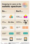
Designing for users on the autistic spectrum
Do
- use simple colours
- write in plain English
- use simple sentences and bullets
- make buttons descriptive – for example, Attach files
- build simple and consistent layouts
Don’t
- use bright contrasting colours
- use figures of speech and idioms
- create a wall of text
- make buttons vague and unpredictable – for example, Click here
- build complex and cluttered layouts
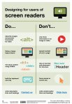
Designing for users of screen readers
Do
- describe images and provide transcripts for video
- follow a linear, logical layout
- structure content using HTML5
- build for keyboard use only
- write descriptive links and heading – for example, Contact us
Don’t
- only show information in an image or video
- spread content all over a page
- rely on text size and placement for structure
- force mouse or screen use
- write uninformative links and heading – for example, Click here
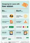
Designing for users with low vision
Do
- use good contrasts and a readable font size
- publish all information on web pages (HTML)
- use a combination of colour, shapes and text
- follow a linear, logical layout -and ensure text flows and is visible when text is magnified to 200%
- put buttons and notifications in context
Don’t
- use low colour contrasts and small font size
- bury information in downloads
- only use colour to convey meaning
- spread content all over a page -and force user to scroll horizontally when text is magnified to 200%
- separate actions from their context
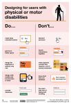
Designing for users with physical or motor disabilities
Do
- make large clickable actions
- give form fields space
- design for keyboard or speech only use
- design with mobile and touch screen in mind
- provide shortcuts
Don’t
- demand precision
- bunch interactions together
- make dynamic content that requires a lot of mouse movement
- have short time out windows
- tire users with lots of typing and scrolling
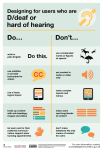
Designing for users who are D/deaf or hard of hearing
Do
- write in plain English
- use subtitles or provide transcripts for video
- use a linear, logical layout
- break up content with sub-headings, images and videos
- let users ask for their preferred communication support when booking appointments
Don’t
- use complicated words or figures of speech
- put content in audio or video only
- make complex layouts and menus
- make users read long blocks of content
- don’t make telephone the only means of contact for users
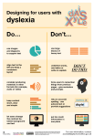
Designing for users with dyslexiaDo
- use images and diagrams to support text
- align text to the left and keep a consistent layout
- consider producing materials in other formats (for example, audio and video)
- keep content short, clear and simple
- let users change the contrast between background and text
Don’t
- use large blocks of heavy text
- underline words, use italics or write capitals
- force users to remember things from previous pages – give reminders and prompts
- rely on accurate spelling – use autocorrect or provide suggestions
- put too much information in one place
End of images descriptions]
Passionate shoutout to ^ @studyinthemoon ^ for realizing that maybe, just maybe, posts talking about online accessibility should be accessible! Idiots.
I do think part of the point is to be able to print the posters. I think they are also aimed at telling abled people what to do; the rest of us are likely to know most of these tips. Also, this is a good time to talk about competing access needs!
Sometimes what helps one person makes the thing less accessible to another person. Writing out the posters in plain text helps people who need screen reading software or scaleable text magnification to read. However, long lists with no visuals are harder for most other people to read, especially for people with learning disabilities or processing disorders. (And tumblr’s handling of lists doesn’t help.) Including both options when possible is best!
In fact, the list is about designing different things for different needs. A good site design will try to combine as many things as possible, especially for an all-access site like a library home page, but if you’re specializing—say, a site for teaching autistic people useful scripts for everyday life, Duolingo-style (and seriously if there aren’t sites like that aimed at adults there should be)—you can tailor that design more to that group specifically. (Though such a site would also mean needing accessibility for motor issues and HoH people by default, because that’s so common with autism. I like big buttons to click and simultaneous text and audio. Honestly, the audio can go faster than normal listening if I have text, I just need to hear pronunciation and tone.)
So basically we need both the text caption and images in this post. Let’s try to make things as accessible as possible, with breadth of accessibility as well as basic standards for each type of access.
